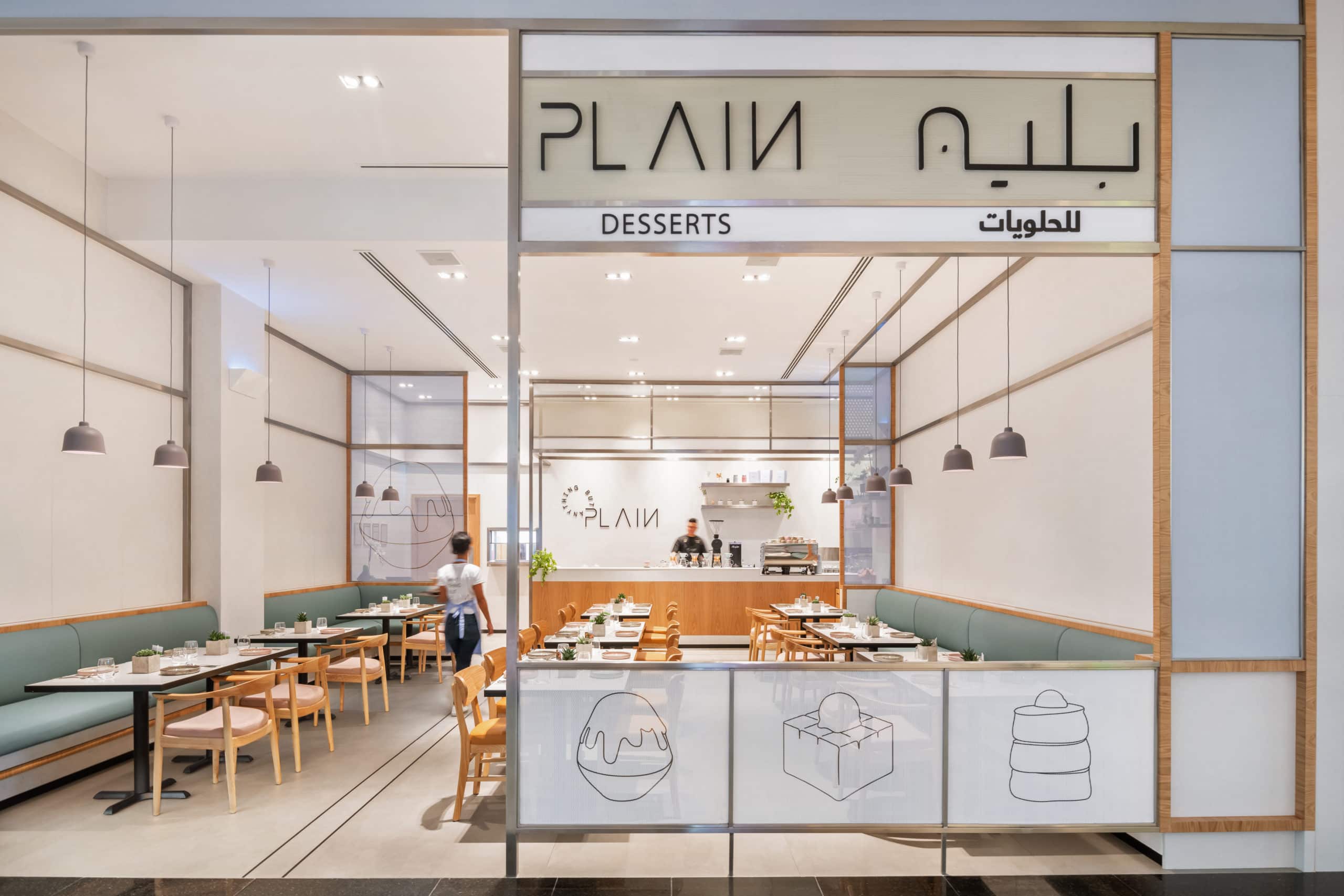
 H2R Design worked on the design and fit-out of PLAIN, a new homegrown dessert concept in the UAE. Located in City Centre Mirdif, the new unit in the mall was designed to create a space that celebrates the combination of high-quality desserts in a tranquil ambience, within a unique and uplifting experience. The aim was to create a clean yet attractive aesthetic that would complement a PLAIN’s wide range of flavours and desserts, while still allowing the products to stand out.
The inspiration and mood of the concept can be defined as a monochromatic neutral space, with hints of soft colours and touches of warmth from timber furniture and panelling on some joinery items. The overall theme is tonal and understated yet fresh. H2R Design created a simple and sophisticated logo with clean typography paired with a playful personality that is evident through the pastel colour palette. This has become the brand’s main identifier and the general tone of voice. Custom line illustrations were also introduced, giving the brand a harmonious balance between elegance and play.
H2R Design studied the depths of PLAIN to design a space that truly reflected its identity. The research uncovered the concept’s origins, stemming as a place to serve Japanese desserts. This automatically led to the design embracing a more minimal and tranquil approach. However, the concept had to be more unique than that, it needed an identity for itself. Researching the menu offerings, H2R Design incorporated tones that were inspired by the desserts. For example, the toppings on top of the kakigori (a shaved ice dessert), added a splash of colour to the otherwise plain coloured sweet and the honey toast and pancakes having beige and off-white tones. This led to a neutral on the outside, a surprise on the inside approach for PLAIN’s whole design conceptualisation.
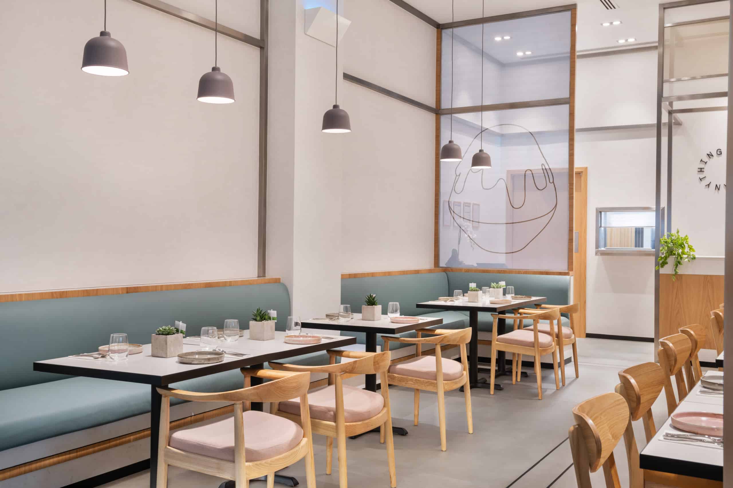 There is alignment from the entrance to the counter at the back, framing the entire space. Tying in the branding with the interior was crucial and this is how H2R Design created the concept from paper to build. Overall, straight simple lines are displayed throughout the space, where everything is there to be functional, while still maintaining a minimal beauty. Due to how minimal space is, H2R Design had to pay attention to details, with how frameworks met, the datum lines of the mesh, and perfecting every single joint.
The use of grey micro-toppings, stones, floor tiles and greys in the structure allowed for H2R Design to create a very lightly coloured space for the display of the food to burst and reveal its personality. Oak timber has also been used throughout the space to ignite some warmth amongst the monochrome mood.


Latest Magazine