What a makeover!
 Located on the edge of Vieux-Longueuil in Canada, this typical 80s split-level had remained virtually unchanged since its construction. This residence deserved a makeover to properly accommodate its new occupants; a couple of young Montrealers wishing to enjoy the qualities of an isolated suburban house while remaining close to the Montreal business center.
The mandate
The mandate for DESK architectes was to design the complete interior renovation of the building. The kitchen, bathroom, and master bedroom had to be completely reshaped. It was necessary not only to replace all the interior finishes but also to create a significant new aesthetic by magnifying the intrinsic qualities of the building and by optimizing the functional relationship between rooms.
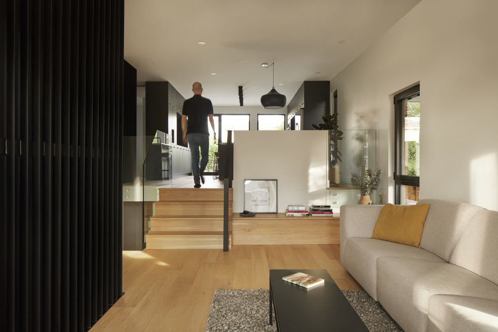
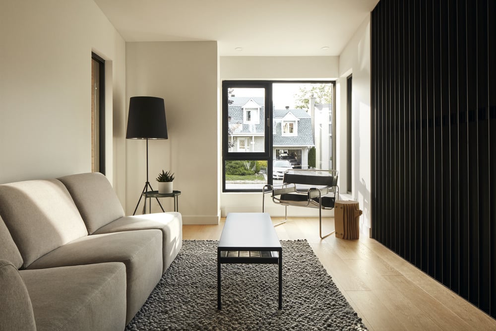
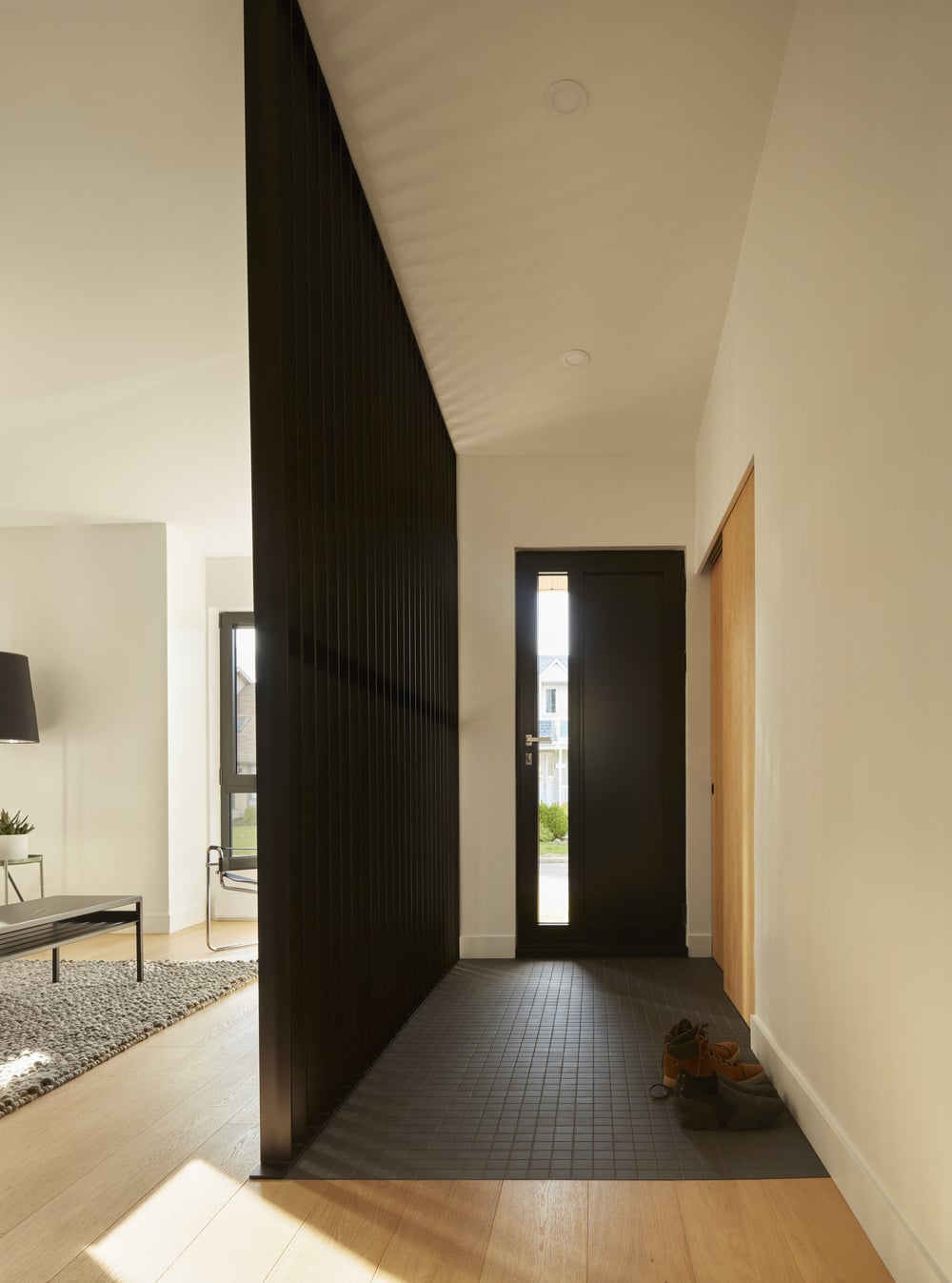
The architectural concept takes advantage of the typical characteristics of a split-level ground floor. The living room of these buildings is generally a long open space, lacking in a spatial hierarchy. The concept, therefore, proposes to organize the space, without partitioning it, by adding metal claustra and blocks of built-in furniture. Thus, these dark elements are oriented so as to emphasize the link from the front to the back of the room. They frame the views and traffic from the entrance to the terrace without obstructing them.
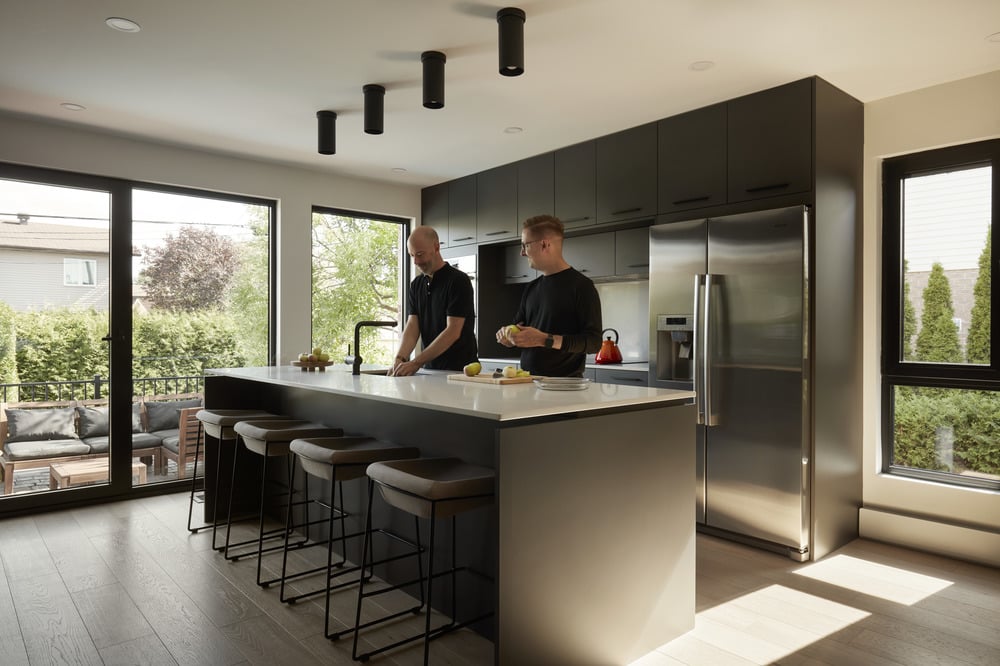
The kitchen, formerly organized in a “U” shape, has been completely reconfigured. Two large blocks of integrated built-in now face each other to frame a vast functional island. The new configuration of the kitchen provides more storage spaces and freed up the rear wall to allow wider openings to the backyard.
The bathroom has been reconfigured to create two distinct areas; the light zone combines the vanity, the medicine cabinet, and the bath while the dark zone combines the toilet and an Italian shower.
The Renovation C+G is a rehabilitation exercise of a typical suburban split-level. It reveals the potential hiding in older houses in a real estate market where new constructions are often preferred.
Photo credit: Maxime Brouillet

