Referred to as the “dark side” by locals, Kowloon has long been the less attractive stepsister to glamorous Hong Kong island. “But this is the exact neighbourhood where I grew up, where my mom went to work and where I went to school; where the first modern Regent Hotel stood, and where my parents would take me on a weekend outing,” notes Ed Ng, one of two founders and principals of AB Concept.
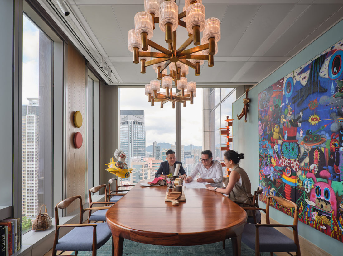
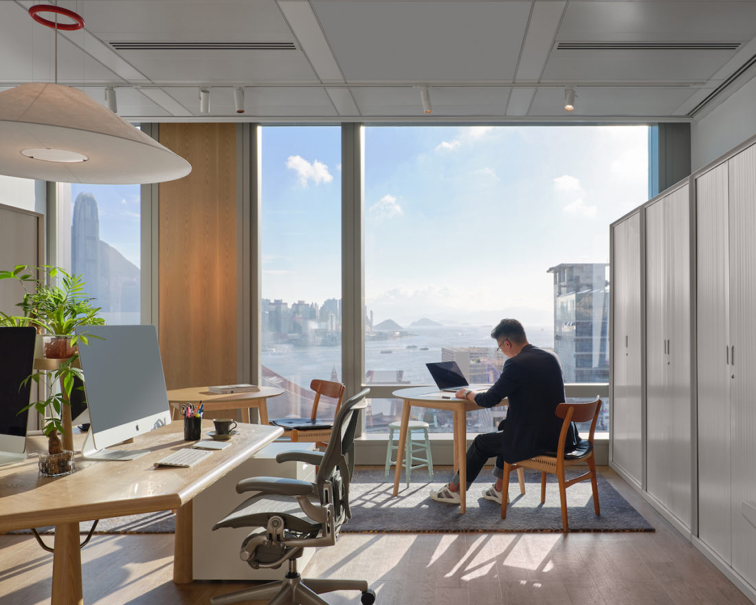
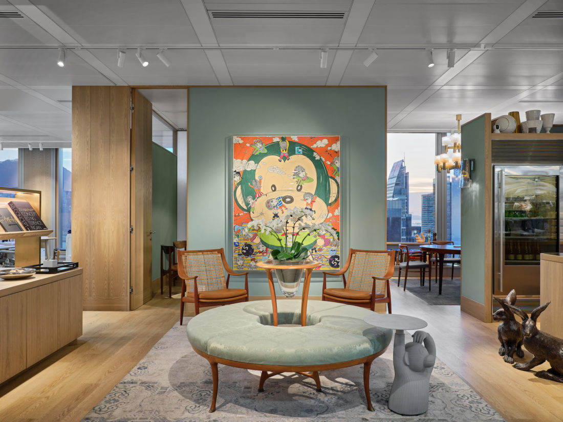
AB Concept’s new office is part of K11 Atelier , the innovative next-generation workspace inside the Victoria Dockside building. “We are very excited about the move, not just because of the address but because this is where things are happening now. We are also taking this opportunity to change the layout of our office and present a new concept of a collaborative work environment”, says Ed Ng.
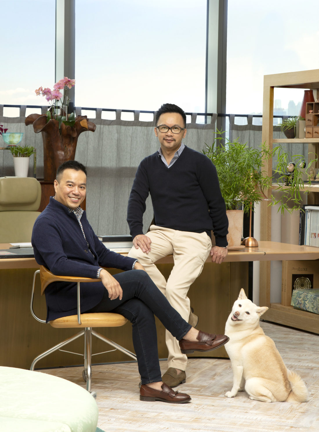
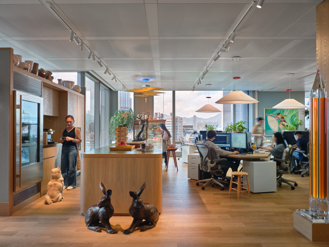
“Each time we moved, our office gave us a new platform to rethink how the teams should be organised to optimise the workflow, directly translating our design methodology and logistics. We no longer have principals’ desks, for example. My partner Terence Ngan and I will be “managing by walking around” and interacting with the teams more directly. The new office thus features more cooperative spaces and a more thoughtfully curated collection of materials. We used to have an enormous collection of samples at our old office, where we had the luxury of space. But in the end, we found that it takes a lot more time to select the right materials and you end up using only a portion of truly special samples anyway.”
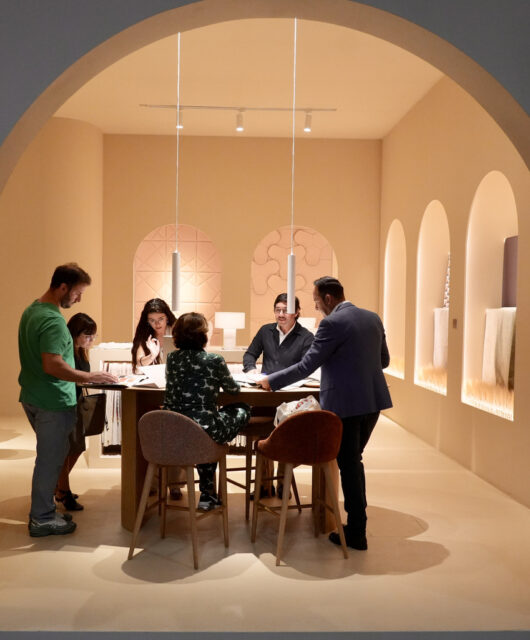
“In the new office, we purposely allocated less space for our sample library as a complete opposite to the the-bigger-the-better concept we had previously adopted. Now we have to be extremely selective with what goes into the library. Plus, much more is now available online and digitally anyway,” explains Ed Ng.
The integration of the principals’ offices into the main office and changes to the sample collection allowed the interior architects to create a more intimate and fluent setting. Materials now surround the working areas instead of being hidden away in a rack; hexagonal desks have replaced straight benches to enhance communication. “We also use panoramic monitors to guarantee sufficient digital desktop space, yet the corners remain open to turn into ad-hoc co-working areas.
