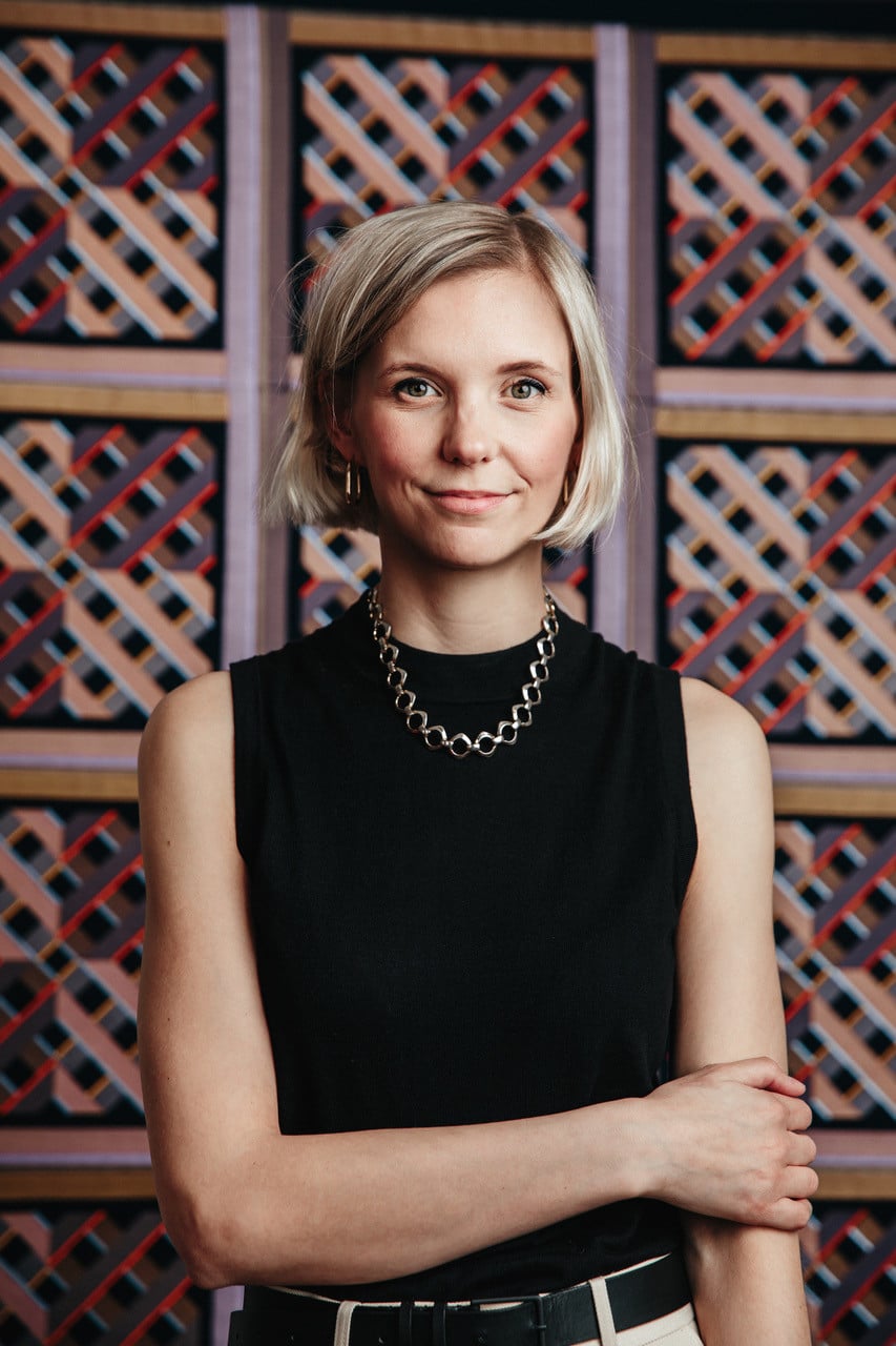
Dyson’s Colour Story: Innovation Meets Design
Amelia Ayerst, CMF Design Manager at Dyson, shares insights into the brand’s approach to colour, materials, and finishes. From inspiration drawn from nature and engineering to the influence of Dyson’s discontinued electric vehicle project, discover how Dyson transforms technology into a statement of style and innovation.
What inspired Dyson to focus on limited edition colours for its haircare technologies?
The colours, materials, and finishes used on our products are designed to celebrate functionality, whilst elevating the technology within. Haircare specifically is an intimate, daily ritual, and our goal is to ensure that Dyson products not only perform exceptionally but also feel unique and tailored to users’ lifestyles. By offering distinctive colour options, users own a product that feels bespoke and exclusive. It’s about transforming technology into a statement piece — functional yet beautiful — allowing users to celebrate individuality in their haircare routines.
How does the design team decide which colours make the final selection for a product launch?
Dyson products are more than just appliances—they are statement pieces that blend cutting-edge technology with sleek, modern design. From their minimalist aesthetics to their innovative engineering, each product is crafted. The team creates colour palettes that complement the function and form of the machine. To help simplify a machine’s complexity, for example we use colour to highlight the technology and draw attention to where you typically interact with the machine e.g. in the special-edition strawberry bronze devices, the buttons are a nod toward uncut sapphires, giving contrast to the pink and highlighting airflow or temperature options. technology
The look and feel of a Dyson machine can also be deliberately evocative. In line with our performance-based engineering approach, we choose materials, finishes, and textures often associated with heavy engineering, industrial facilities, aeronautics, and architectural infrastructure. The way we use colour, materials, and finishes helps ensure our machines reflect the highest possible standards of engineering with the lowest possible tolerances.
Can you share more about the influence of Dyson’s discontinued electric vehicle project on the Prussian Blue and Rich Copper colourway?
The Prussian Blue and Rich Copper exclusive colourway was inspired by Dyson’s Automotive project. A copper accent was paired with the dark blue base colour chosen for the car’s interior, drawing inspiration from the tones seen in precious metals. The colour combination was first put together by the design team, as they sought to break away from the various shades of black that are frequently used in the automotive industry. By challenging the look, feel and form of our technology, we can visually reflect that the pioneering technology inside is also different.
We had to pause the electric vehicle project, but the colourways still hold a special place in James’ heart, which is why you can see their influence across our hair care devices.
How do unconventional inspirations shape the creative process for new colour choices?
The design of Dyson products is top-notch, which is why the selection of colours and finishes is equally important. Every detail contributes to creating a statement piece that seamlessly blends aesthetics with innovation. The research and development of these colours and finishes mirror the intricate engineering and testing processes that shape all Dyson products. We push our design teams to explore inspirations beyond traditional palettes, drawing from nature, everyday objects, and unexpected sources to create colours that evoke emotion and capture attention.
For example, the strawberry bronze range was a result of the team visiting the Dyson Farming sites nestled deep in the British countryside to explore the pigments of the high-quality, nutritious ingredients that are grown there, and the Dyson strawberry stood out.
Exploratory work commenced as the team investigated how the natural dye from strawberries interacts with various materials, allowing the discovery of an array of different shades and tones. The final chosen pigment was the result of this exploration. From a single strawberry came a magnitude of hues, all brought together to create a complex shade of pink, tinged with hints of red, peach, and orange – creating a unique and striking finish.
What role does cultural significance play in selecting limited edition colours for global markets?
We recognise the profound impact of colour and its ability to shape perceptions and experiences. Our teams conduct extensive research and collaborate with regional experts to ensure that every color choice aligns seamlessly with local traditions, aesthetics, and preferences. By integrating cultural insights into our design process, we create products and spaces that not only look beautiful but also feel meaningful and authentic to the communities they serve.
We unveiled our Red Velvet and Gold range recently, celebrating both Lunar New Year and Valentine’s Day. Red symbolises luck, prosperity, and love, making it a popular choice during festive seasons. Luxe shades of gold were incorporated as they represent success and in Cantonese, ‘mandarin – 柑’ and ‘gold – 金’ sound similar.
This approach allows us to connect with diverse audiences authentically, enhancing the appeal of our machines while celebrating global cultures.
How important is staying on-trend versus creating timeless designs when choosing colourways? Trends may be fleeting, but functionality and user experience endure. That’s why we prioritise tactile solutions that address real-life challenges people encounter with everyday products. Through extensive research, cutting-edge technology, and continuous innovation, we refine and enhance designs to improve usability and performance. Our goal is to create timeless designs that go beyond aesthetics—products that remain relevant, intuitive, and desirable for years to come.
Could you describe the testing process for a new colour to ensure it aligns with Dyson’s brand identity?
The testing process for new colours at Dyson is rigorous. We draw inspiration from a wide range of sources, from heavy engineering, industrial facilities, aeronautics, and architectural infrastructure, to elements like nature and everyday objects. Alongside this, we consider cultural insights and consumer preferences to ensure that chosen colours resonate with audiences.
The selected colours are tested on various materials and factors like finish, texture, and sheen are also evaluated. Durability tests are conducted and colours are subjected to wear-and-tear simulations, UV exposure, and heat resistance tests to ensure they retain their vibrancy and appeal over time, even with regular use. Prototypes in the new colour are shared with select focus groups representing our target audience. Feedback on emotional resonance, appeal, and brand alignment is gathered and refined. By following this meticulous process, Dyson ensures every new colour embodies the innovation and quality synonymous with our brand, creating products that are as visually iconic as they are technologically advanced.
How often does Dyson refresh its colour palette for haircare technologies, and why?
The limited-edition colourways are designed to reflect current consumer preferences and seasonal sentiments and there are no set number of refreshes a year. However, during the year-end gifting season, we typically introduce a new colour to evoke celebration and joy, and to enhance the appeal of our beauty range as thoughtful gifts.
What challenges arise when translating unique inspirations into actual product colours?
We face challenges when it comes to material compatibility. Inspirations like natural objects or textures, such as strawberries or velvet, may not directly translate to the materials used in Dyson products. Achieving the same vibrancy, depth, or subtle gradients on materials like metal or plastic can be technically challenging. Likewise, we have to ensure longevity, so the chosen colour must withstand wear and tear, UV exposure, and regular handling without fading or losing its appeal. Developing pigments and finishes that meet these requirements while staying true to the inspiration requires extensive testing, which is why we meticulously test every colour to not only reflect its inspiration but also uphold Dyson’s commitment to quality and excellence.

Latest Magazine