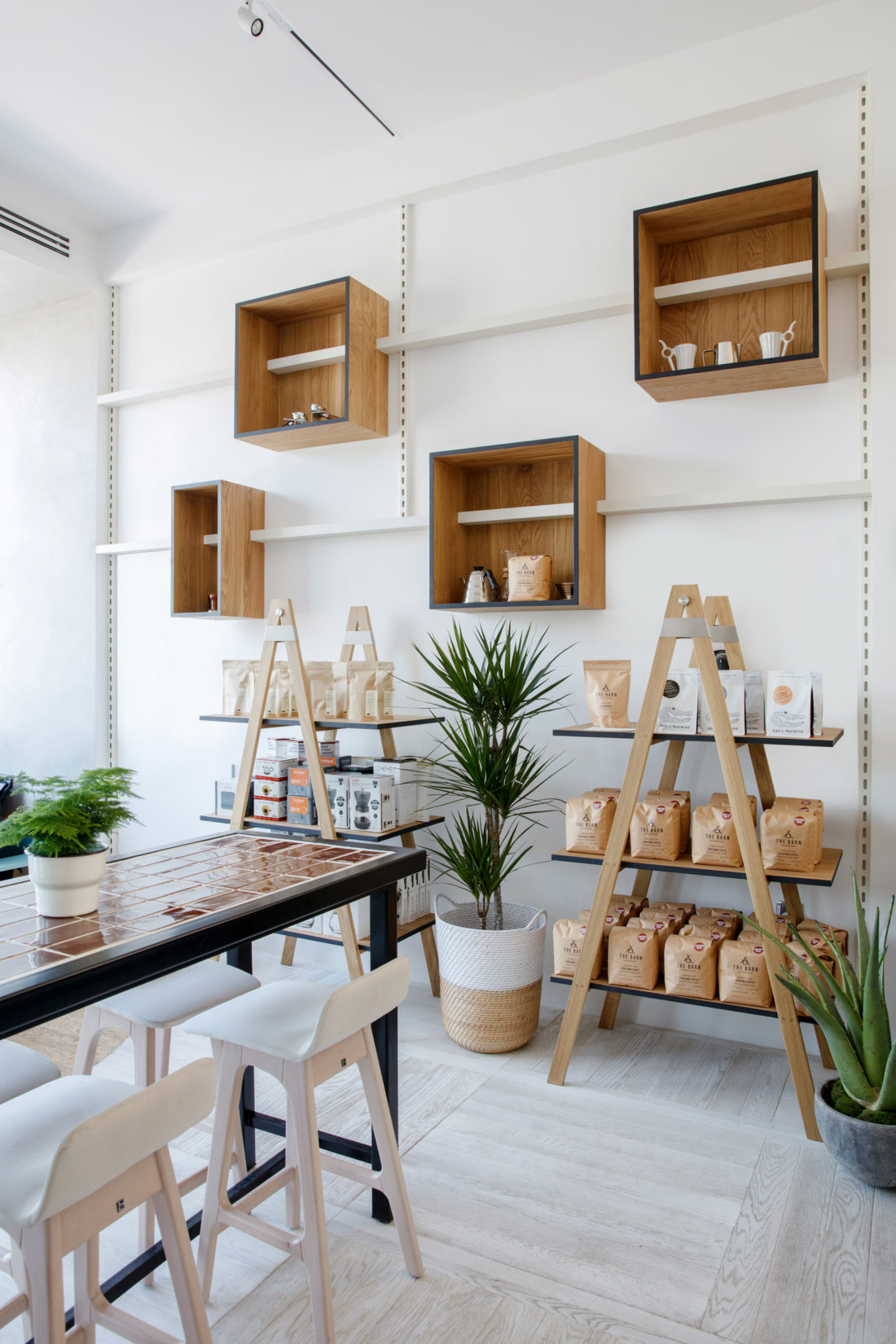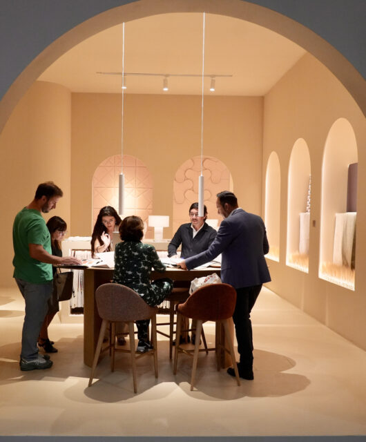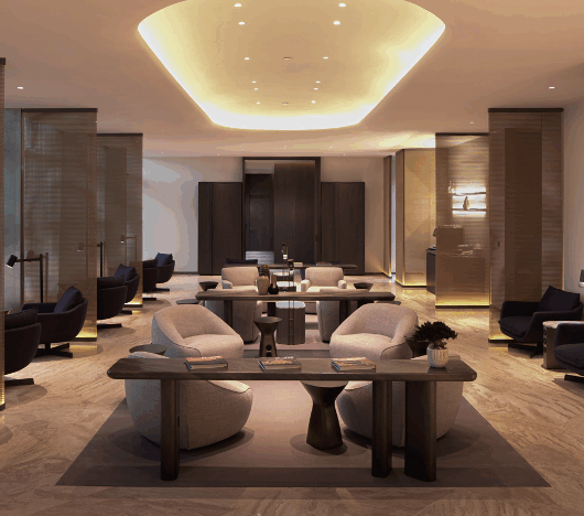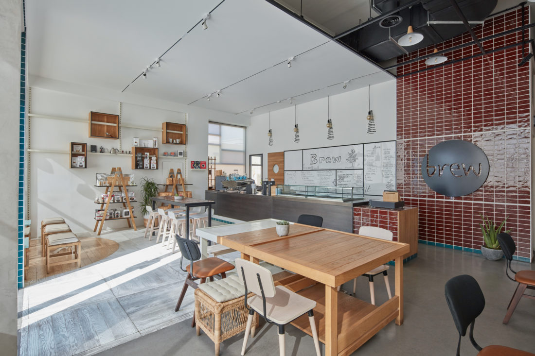
H2R Design aimed to produce a space that would draw passers-by in, and to meet the owner, to discover his love for the process of coffee making and demonstrating how fine specialty coffee can be an art form. To achieve this, a focus was placed on using materials that added warmth, allowing light to pass through gently, resulting in a revitalised space mixed with textured painted walls and wooden furniture.
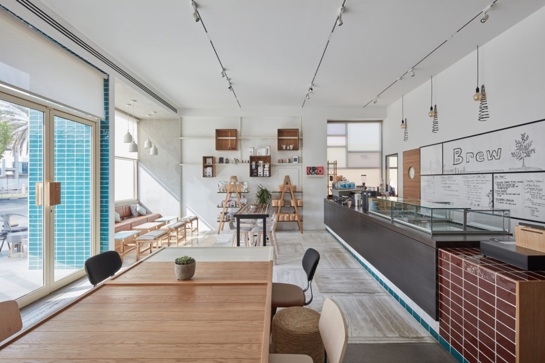
The decor follows the natural theme with light surfaces and notable in its clean minimalist interior. There are intriguing meeting points of materials such as the tile and paint with the wood and concrete.
The usage of woods with warm colours in strategic areas have created a natural and comfortable atmosphere. One wall is covered in textured paint to match the floors, which seamlessly blend in with the rest of the café. Arranged across the wall are numerous wooden shelves which symmetrically display coffee bags and house products.
The wall logo is covered in glossy undulated handmade tiles from Spain matching the counter table. Achieving the right tile level from the wall and counter was a challenge for the team. To manage this, only one person worked on placing up the tiles to ensure right spacing.
The flooring is a mixture of wood and cork, where the cork gives off the impression of a rug. Both elements offered a homey and vibrant energy.
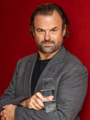
“One significant use of material is the cork on floor. The best thing about this material is how soft and yielding it feels. It is something completely different and it is a good insulator which reduce noise from being transmitted throughout the café,” explained Husain Room, co-founder of H2R Design.
Other design features include a ribbed wooden kitchen door and ceiling lights above counter table that have spiral pendants painted on the wall creating a quirky look.
“Brew has been a very personal and soulful project for us. We had the opportunity to make all the decisions from the minute to large scale changes which impassioned us to create a remarkable space that we’re very proud of,” commented Hasan Room, co-founder of H2R Design.

