H2R Design gives TGIF outlets a new look
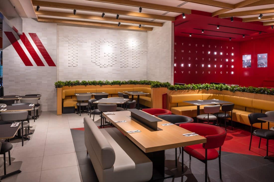
The Ibn Battuta (Dubai) and Al Wahda (Abu Dhabi) branches were completed in February 2022, following the Seaside (Kuwait) branch was completed in mid-2021, with the remaining outlets are expected to launch within the year.
The design intent was to reinterpret and elevate elements of TGI Fridays’ origins, but also to create a modern and fresh new look to embrace millennial trends and enhance the dining experience. There was a need to differentiate areas of the restaurant to create a range of experiences which can accommodate more intimate dinners to large group gatherings.
Speaking about the project, Hasan Roomi co-founder of H2R Design said: “TGI Fridays is a brand everybody knows and loves, so we were excited to work on the reimagining of six of their key outlets. We focused on creating a fun environment that prioritises the customer experience and promotes sharing good times, much alike the brand values. We wanted the design to create a mood that makes guests feel happy and special and reflects what’s on the menu and the core values of the brand.
He continued: We are also incredibly proud that our work has also inspired the design of other outlets in the region (Egypt, KSA, Qatar, and Kuwait) and look forward to seeing them all come to life.”
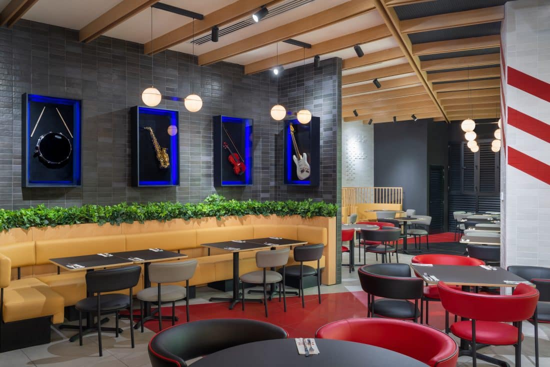
Distinctive furniture has been used in the space with a combination of rectangular and round tables. Modern chairs in block colors with a range of unique seating options, such as circular constructed booths, communal tables, lounge chairs, benches and banquets allow the customers the option of how they would like to dine.
Bold triangular blocks of black and red add an accent to the flooring and continue to elevate the quirky design.
Personalised experiences can be created with areas sectioned off for different uses. This zoning strategy uses colour blocking and timber/metal planter partitions to create a physical and visual separation. This adds personality and playfulness into the space, while giving a practical solution to different guest preferences.
Another design feature that has been integrated as a new element into all the branches is the minimal wooden beams that run across the ceiling. This elevated the otherwise simple and unornamented ceiling, bringing warmth to the space.
An addition of greenery creates an aesthetically pleasing, relaxing, and inviting atmosphere, whilst also contrasts with some of the more bright and loud design elements synonymous to the brand.
Special features
Everybody knows TGI Fridays for its famous red and white branding and its memorabilia adorned walls. In line with this, H2R created an impressive wall with 3D dynamic backlit letters lighting up to reveal relevant descriptions that embodies TGIF’s customer experience. This eye-catching statement red section also complements the red communal tables and serves as a focal point of interest in the space.
H2R Design has found clever ways to integrate “TGIF” into the design including a special projection brick wall where the letters are juxtaposed into the wall playing with the positioning and rotation of the bricks.
Around the restaurant, much-loved timeless memorabilia are framed in vitrines while modern monochrome posters feature the TGI Fridays letters on iconic city landmarks. The music and sports posters featured in the space are a reminiscent touch to the original TGI Friday’s.
Photographer credit: Alex Jeffries for Ibn Battuta & Al Wahda photos and Mohammad Taqi for Seaside.

