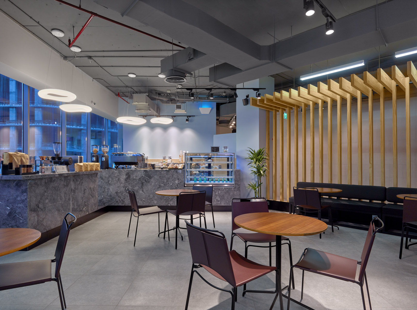
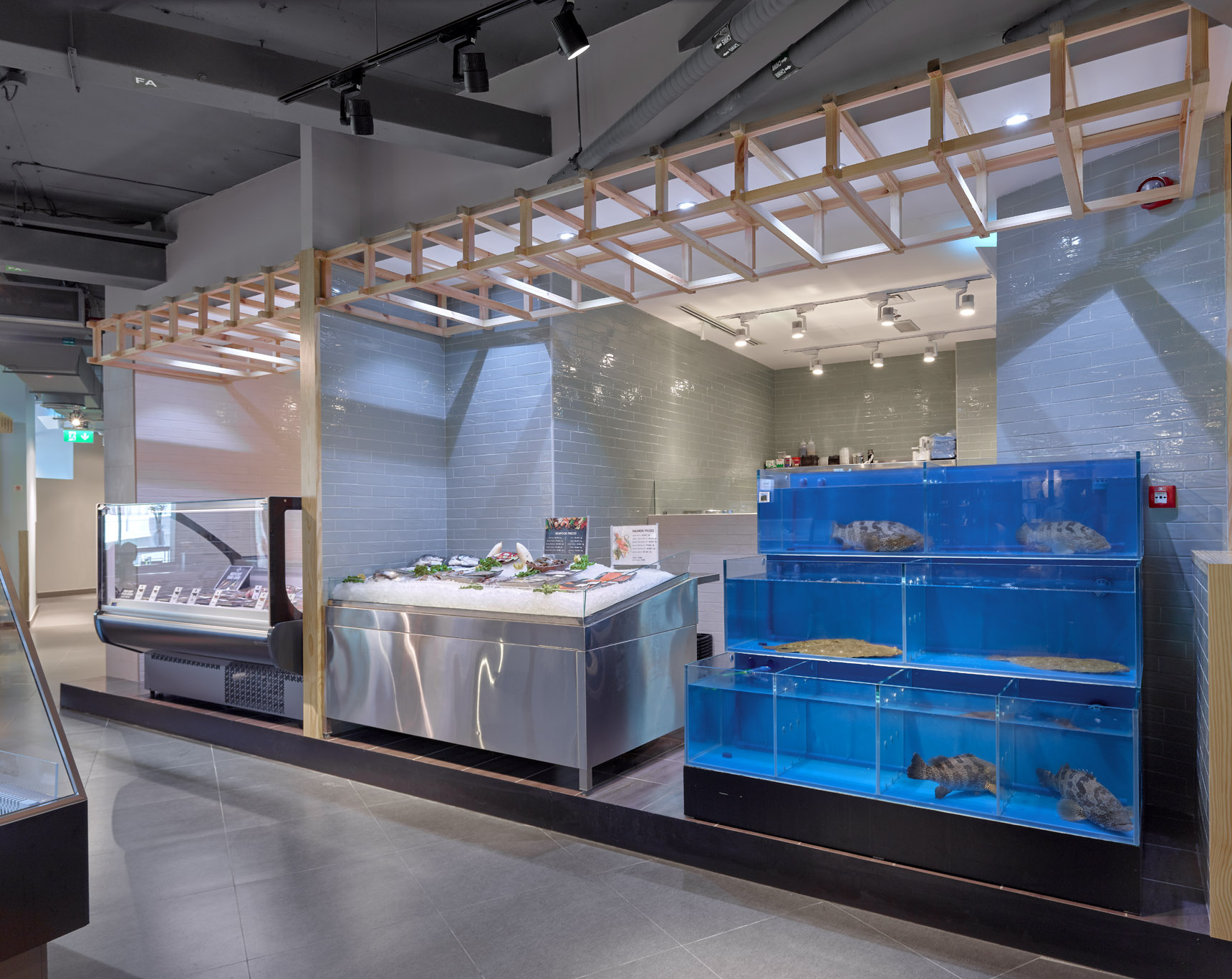
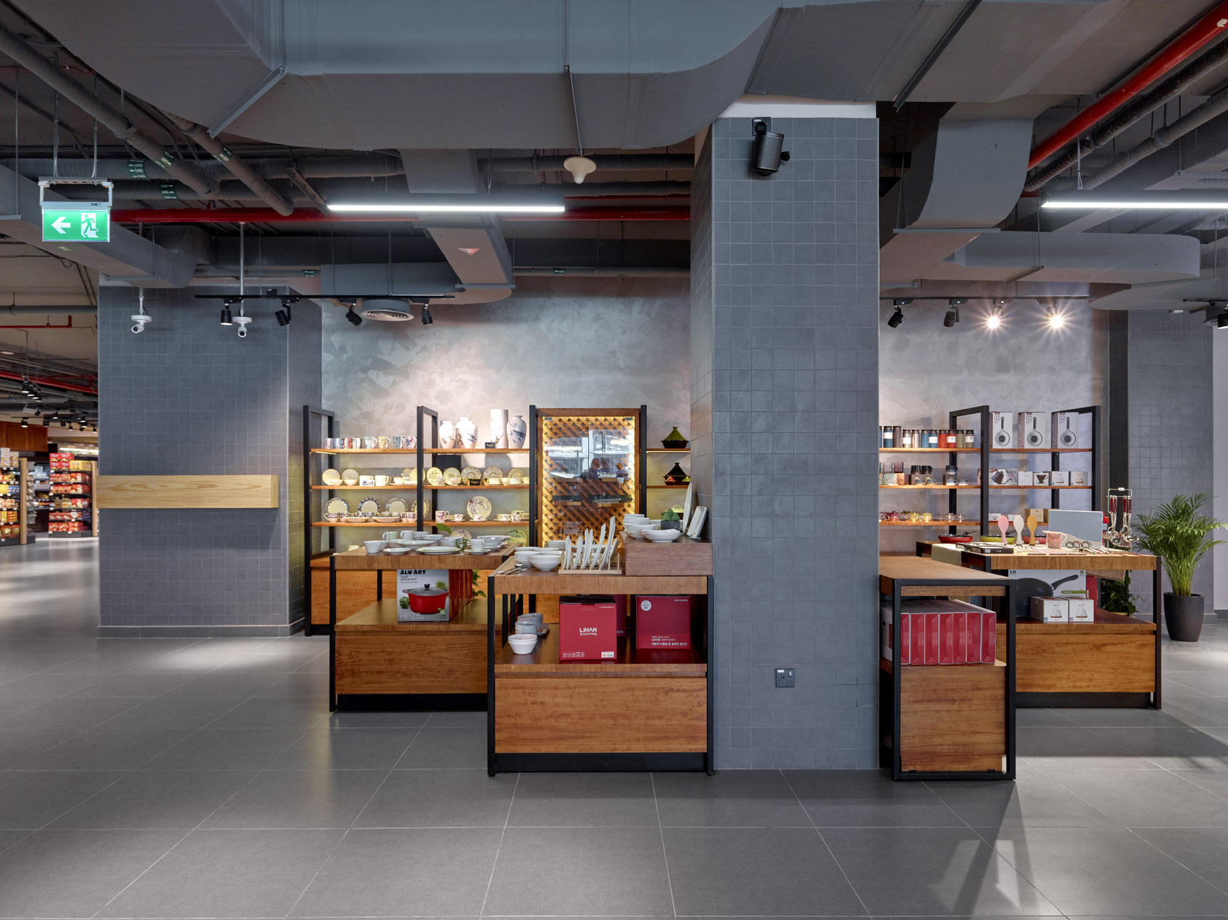
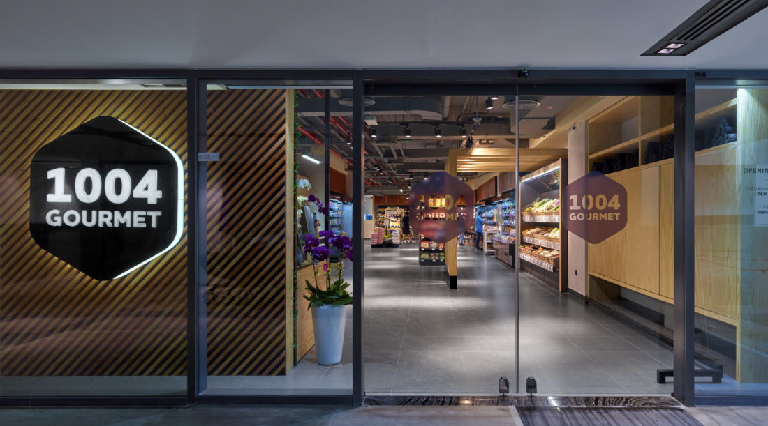
 Studio EM has recently delivered 1004 Gourmet located in the Onyx Tower in Al Barsha Heights, having relocated from its previous home in Al Barsha. Moving location is not the only upheaval this store has undergone. What started as a Korean and Japanese grocery concept, has now fully evolved into a multi-purpose retail space that houses grocery, homeware department, beauty store (Lamise), and a café concept. The task of creating a minimal store design that lends itself to enjoyable and relaxed customer experience was at the forefront of the mind of Emma Stinson, creative director and owner of Studio EM. Stinson says: “Grocery shopping is one of the least pleasant shopping experiences that we have to do. I actually dread it. Cluttered aisle’s, poor flow, overwhelming advertising, signage, and the old school mentality of stock it high and full, are all concepts that give me the shivers. With this in mind, we wanted to create a store, design, and customer experience that avoided all of these pitfalls.”
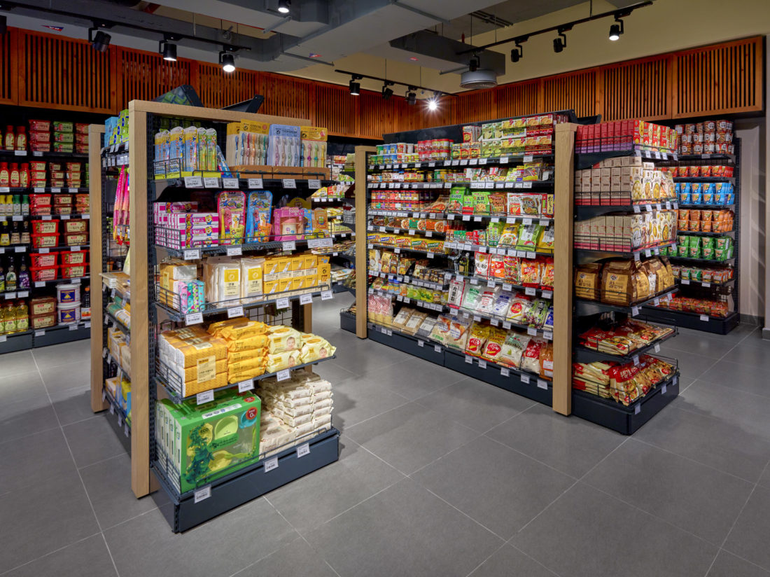
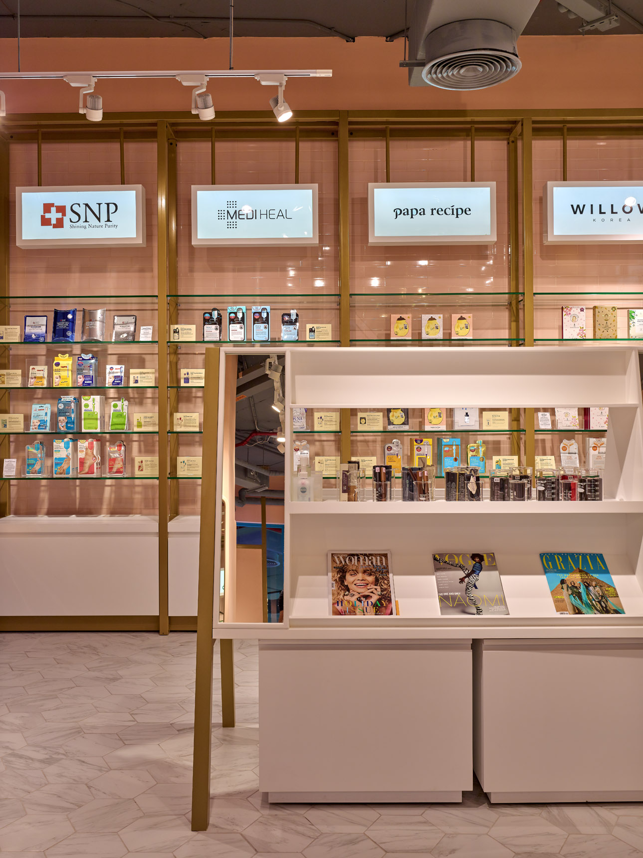
Arches play a key role in setting out each area, dry goods, butcher/fish/ deli, the café, and homewares. With the beauty store, Stinson wanted to create a shop within a shop that could stand alone in the future on its own, rather than lumping a concession into space and to create a statement design that popped against the clean backdrop but still gave vibrancy and would lure you in. “The combination of pink, marble, brass, and teal allowed for this, yet the store is minimal, clean, efficient but beautiful,” adds Stinson.


