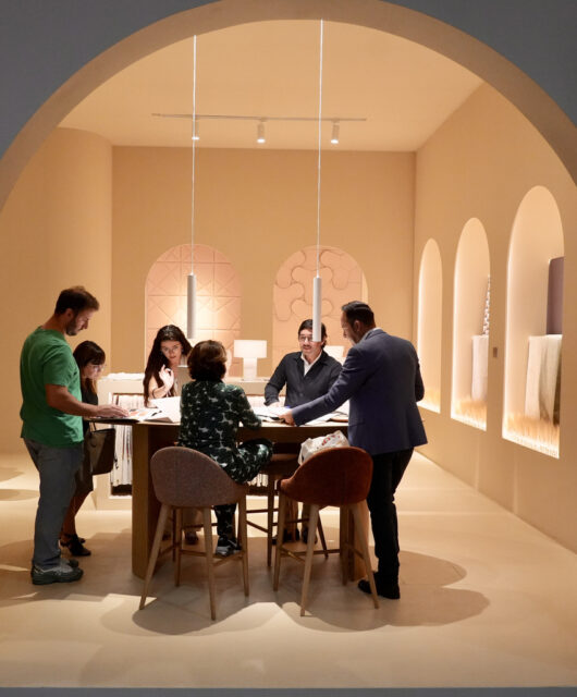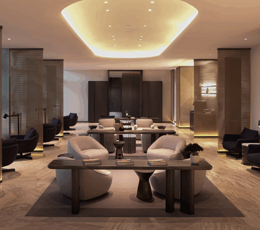
The simple colour block and space are separated by the use of design. Customisation materials make the large space not have a strong sense of regional function. Creating a relaxing and comfortable space, just like the comfortable wearing feeling brought by the high-end cutting materials so it will not feel constrained, but detached and comfortable.
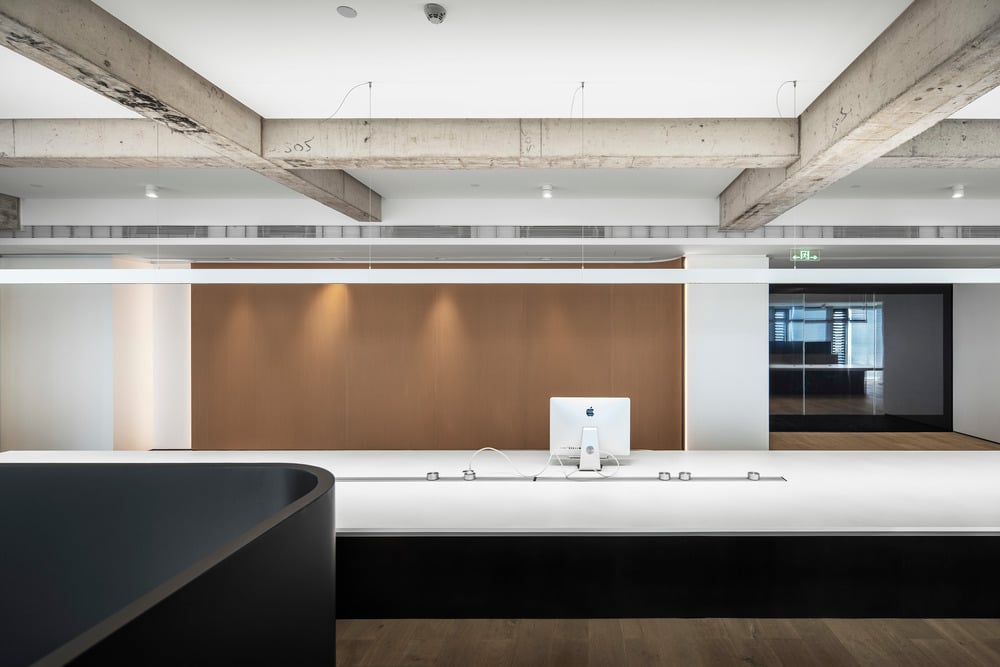
Different from the traditional office space, the entrance chooses the setting of no lobby and no entertainment. Subtraction in the space can make the whole office space more complete. Simple line decoration can be used for spacing, which has the function of separation and no rigid wall spacing. It makes space have more simplicity. It seems to be a simple quilting decoration on the clothing, which is orderly from the far view and close to the view elaborate low-key design.
The use of new and old materials also makes space collide with a new visual atmosphere, just like the use of different materials in clothing, splicing out various collocations.
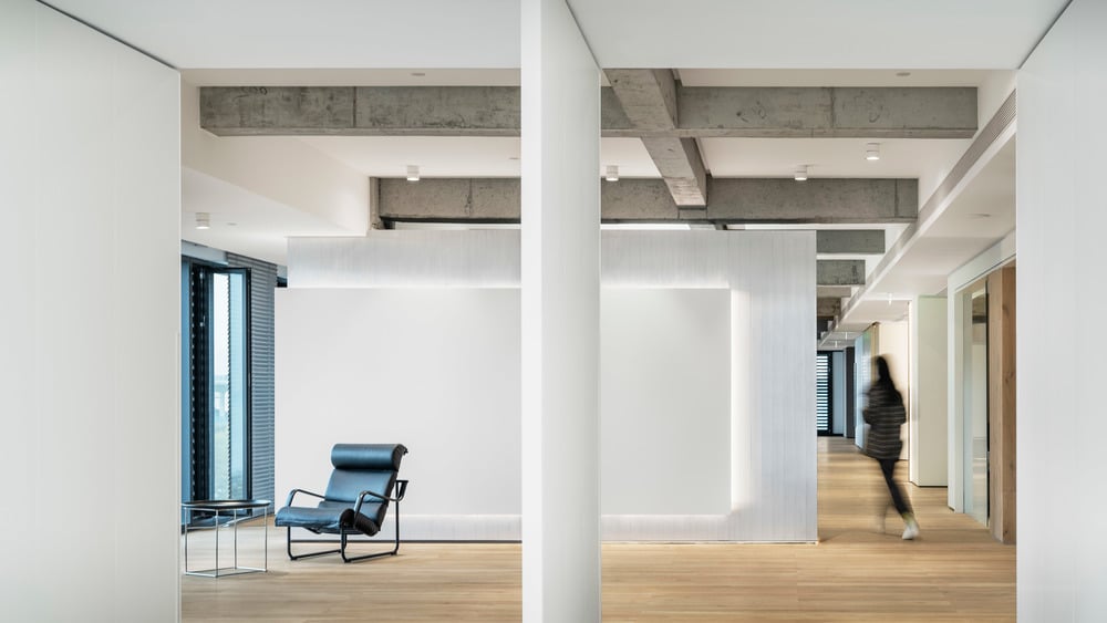
In the fabric exhibition area, the designer chooses the simplest lines for combination. The vision of the space is clean and simple. The design of lighting also makes the delicate materials and clothing displayed incisively and vividly.
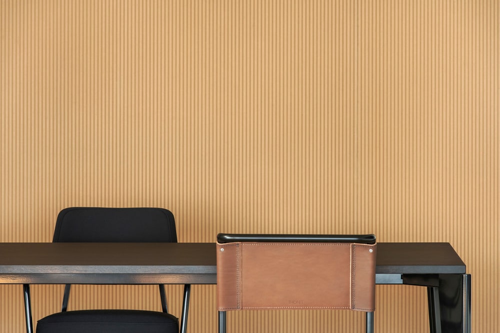
The small coffee box in the space breaks the past that the tea area is separate from the main space. The embedded small coffee and tea bar make time to enjoy a cup of coffee or tea more relaxed and adds a little sense of daily life and interest to the afternoon tea in the working time every day.
Simple things can often offer people more feelings in detail. While space has its own identification degree, it also solves the complex feelings brought by the environment. A new space is playing its infinite potential.
Photo credit: XUE Yutao


