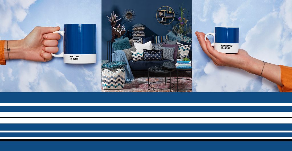
Pantone colour of the year 2020: Classic blue
 Tapping into sight, sound, smell, taste, and texture Pantone makes PANTONE 19-4052 Classic Blue the first multi-sensory Color of the Year in the company’s history.
Pantone, provider of professional colour language standards and digital solutions, announced PANTONE 19-4052, Classic Blue, as the Pantone Colour of the Year for 2020; a timeless and enduring hue elegant in its simplicity. Suggestive of the sky at dusk, the reassuring qualities of the thought-provoking PANTONE 19-4052 Classic Blue highlight our desire for a dependable and stable foundation from which to build as we cross the threshold into a new era.
“We are living in a time that requires trust and faith. It is this kind of constancy and confidence that is expressed by PANTONE 19-4052 Classic Blue, a solid and dependable blue hue we can always rely on,” said Leatrice Eiseman, Executive Director of the Pantone Colour Institute. “Imbued with a deep resonance, PANTONE 19-4052 Classic Blue provides an anchoring foundation. A boundless blue evocative of the vast and infinite evening sky, PANTONE 19-4052 Classic Blue encourages us to look beyond the obvious to expand our thinking; challenging us to think more deeply, increase our perspective and open the flow of communication.”
Imprinted in our psyches as a restful colour, PANTONE 19-4052, Classic Blue brings a sense of peace and tranquility to the human spirit, offering refuge. Aiding concentration and bringing laser-like clarity, PANTONE 19-4052, Classic Blue re-centers our thoughts. A reflective blue tone, Classic Blue fosters resilience.
As technology continues to race ahead of the human ability to process it all, it is easy to understand why we gravitate to colors that are honest and offer the promise of protection. Non-aggressive and easily relatable, the trusted PANTONE 19-4052, Classic Blue lends itself to relaxed interaction. Associated with the return of another day, this universal favourite is comfortably embraced.
“The Pantone Color of the Year highlights the relationship between trends in color and what is taking place in our global culture at a moment in time, a color that reflects what individuals feel they need that color can hope to answer.” added Laurie Pressman, vice p.resident of the Pantone Color Institute. “As society continues to recognise color as a critical form of communication, and a way to express and affect ideas and emotions, designers and brands should feel inspired to use color to engage and connect. The Pantone Color of the Year selection provides strategic direction for the world of trend and design, reflecting the Pantone Color Institute’s year-round work doing the same for designers and brands.”


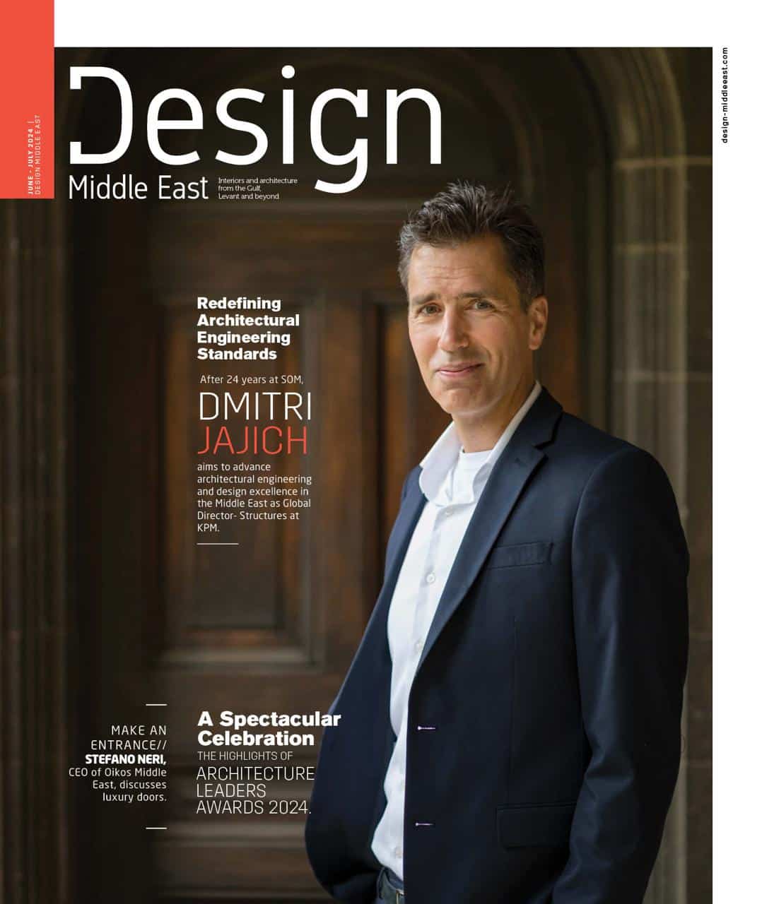
Latest Magazine